BAKFISH Crowler Design Overview
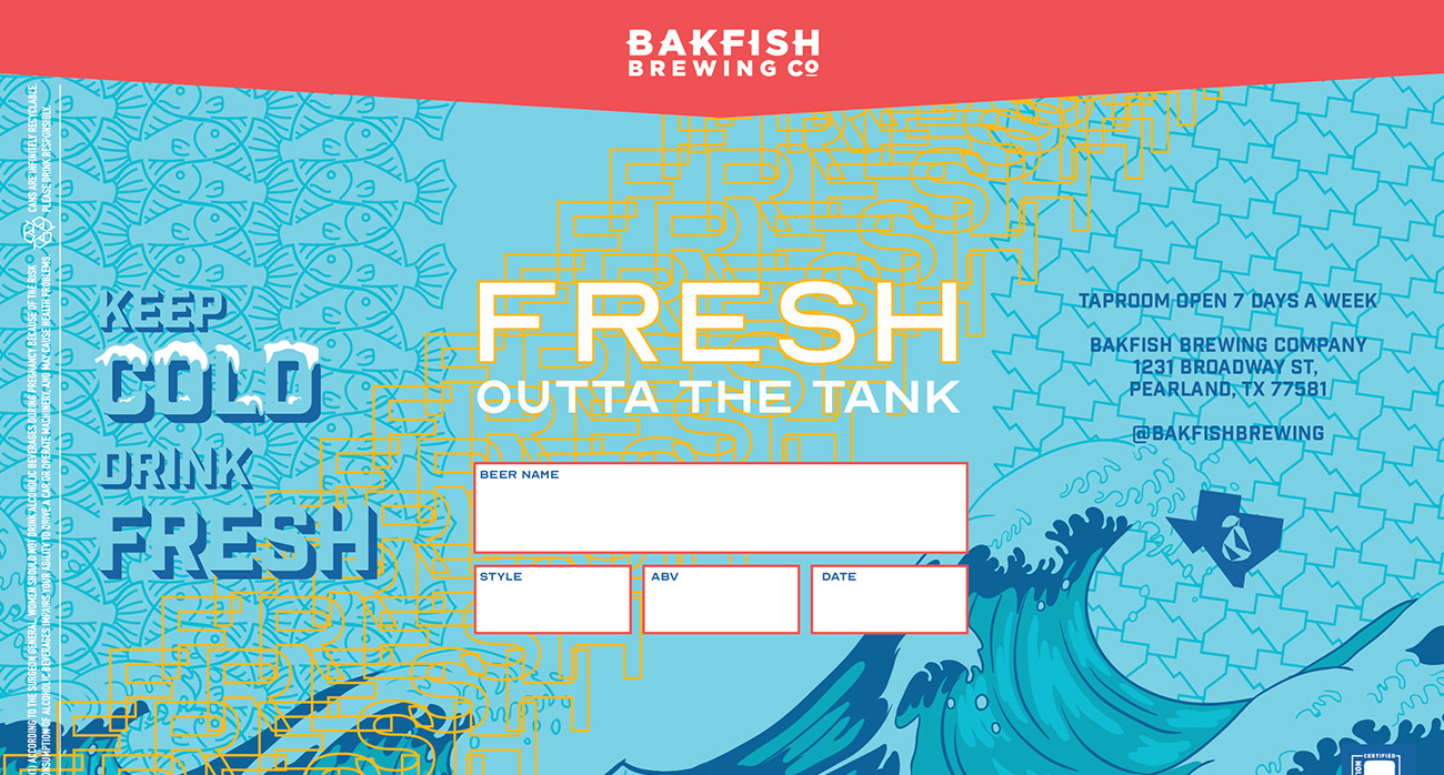
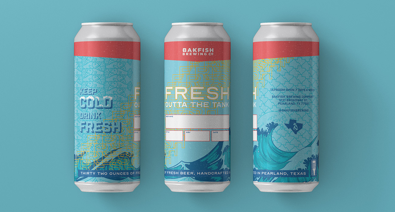
2020 was a bad year for taproom sales, but it was a great year for to-go sales. That’s why BAKFISH wanted to up their label game for their crowlers.
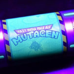
Problem
BAKFISH wanted their new crowler design to be sleek and modern yet not outpace their existing artwork. BAKFISH has a solid visual identity, and their labels and branding have remained consistent over the years, so they didn’t want to rock the boat too much.
Solution
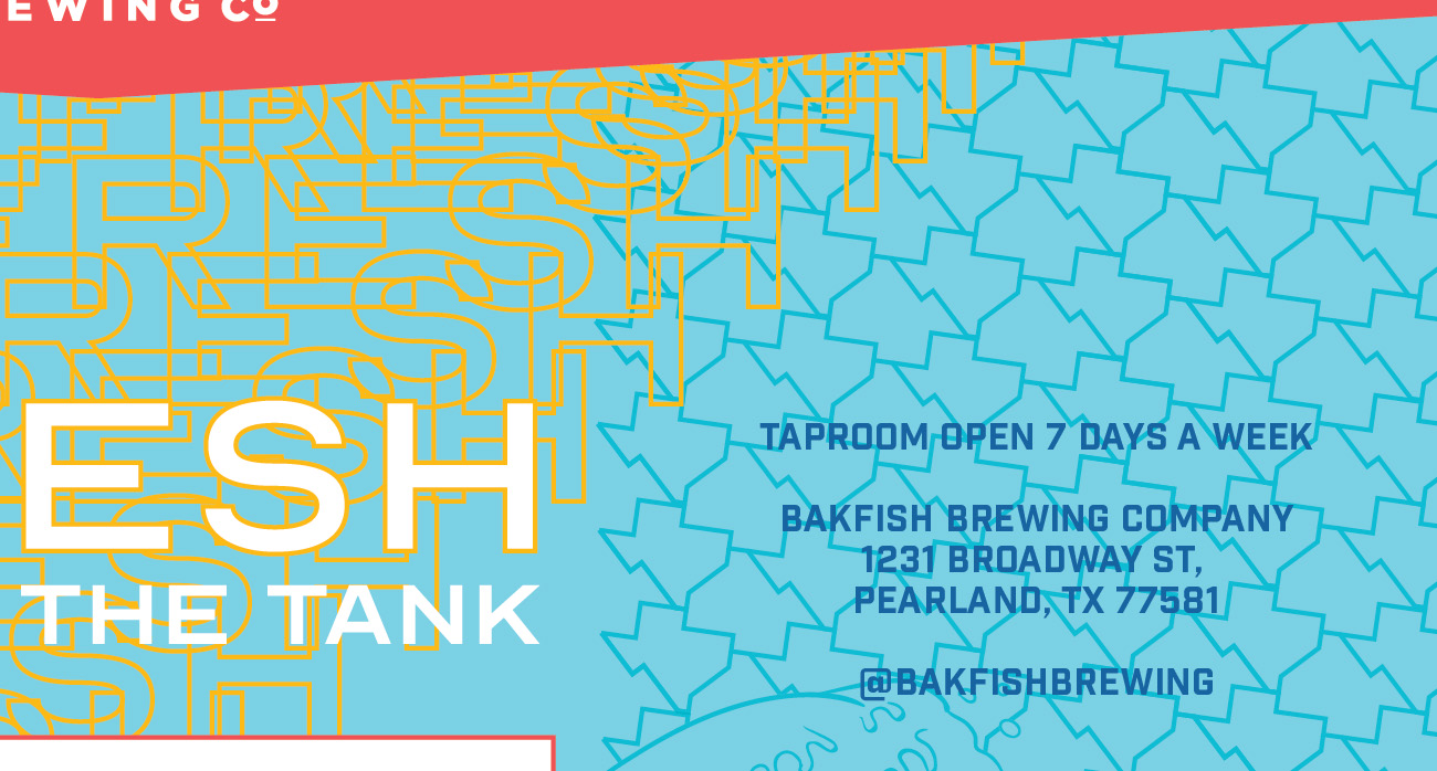
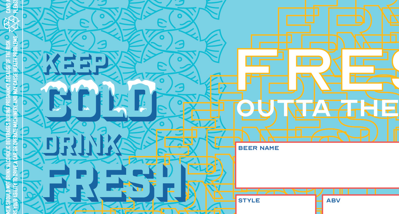
Create a crowler label that visually mirrors their existing labels, but add a touch of modernity with typography and patterns. A tessellation of fish, inspired by M.C. Escher and another of Texas flank the main artwork. These super geometric patterns pay homage to their existing identity meanwhile adding a freshness to the look. To the discerning eye, it’s clear that the crowler artwork is a little different than the other labels, but it’s not too far away.
CONTACT US NOW FOR CROWLER DESIGN
BAKFISH Crowler Design Credits
Art Direction, Graphic Design, Project Management: Anthony Gorrity
Check out These Other Projects


Date
April 27, 2020